Showing posts with label Birthday. Show all posts

Tuesday, October 23, 2012

Delicate Greens

What is your favourite colour? Mine has and will always be green. I attended many schools as a child because my father's work kept us on the move. Uncannily, I was always assigned to green house colours in every school I attended from primary to secondary schools. For me, green is soothing, refreshing, peaceful, lush, vibrant, rich, moist, fragrance of pine and apples, freshly mowed lawn, refreshing, cooling, earthy - it makes me happy.

In card making, I always want to make green cards but with self restraint, manage to create cards/projects in other colours too. I always love the results of my green creations though. So, here's a delicate green version of my Delicate Doilies card in my previous post.

project recipe
stamps: Delicate Doilies  (W124960, C122592), Happiest Birthday Wishes (retired Hostess)
ink: Classic Stampin' Pad - Lucky Limeade (126984), Pool Party (126982), Gumball Green (126861)
card stock: Lucky Limeade (124388), Gumball Green (127543), Whisper White (106549)
tools: Brayer (102395), 1-3/4" Scallop Circle Punch (119854), 1-3/8" & 1" Circle Punches (119860, 119868) 
added pizzazz: Rhinestone Basic Jewels (119246), Stampin' Dimensionals (104430)

have a great day

Friday, October 19, 2012

Brayer Misadventure & Delicate Doilies


Not long after I became a Stampin' Up! demonstrator, I was introduced to the brayer by my upline's upline when we had an afternoon of card making. It didn't seem too difficult but I felt that I could achieve the same results with other techniques. Before long, I realised that pastel blending, ink sponging or water colouring with inks, pencils and crayons could not give me a smooth and/or solid colour transfer on to card stock - it was time to buy a brayer. Armed with my new brayer, I could not achieve the spectacular results I had always seen on the internet. I concluded that I was hopeless at brayering and gave up.


However, at my group Catalogue Party, I was asked to show people how to use a brayer. Why? Because I had sought out Kerry Bunting (whom I call the the Brayer Guru) at the 2012 Melbourne Heartfelt Event and had made sure that I didn't miss her demonstration. I watched it, recorded it and when I tried it at home, again my efforts were a flop. I didn't want to be a bad carpenter blaming her tools but I finally asked Kerry about her opinion on brayers.


Duh! Why did I even ask? I should have known that the answer would be the SU brayer. I have professed in my profile that I am an SU snob yet all this time, I had bought and persisted with a non SU brayer which equals brayering FAIL. So, when I was asked to showcase brayering at the catalogue party, I panicked!

I still had this brayer,

failure with non SU brayer
the real deal - SU brayer
not this one

and was totally unsure if I could produce the goods!


I had to go borrow my upline's SU brayer and ahhhhhhhhhh......, a big sigh of relief. I could actually brayer quite nicely. Indeed, all brayers are not made equal and this misadventure with a "happily ever after" ending reinforces my belief that Stampin' Up! produces and/or provides us with high quality products although I temporarily forgot this fact!

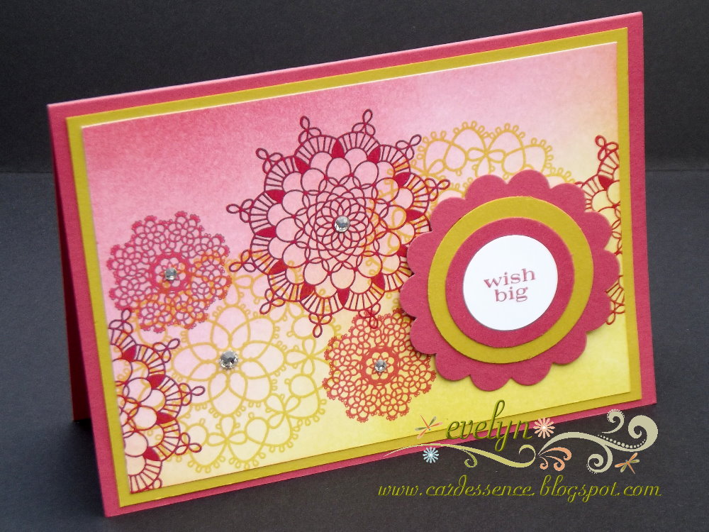
Thus, I was able to show everyone how to brayer 2 colours together. Everyone got to make a card topper like my sample below. Do you like it? The colours reminded me of Indian Sarees, don't you think?

project recipe
stamps: Delicate Doilies  (W124960, C122592), Pennant Parade (W125012, C122742
ink: Classic Stampin' Pad - Primrose Petal (126858), Summer Starfruit (126991), Raspberry Ripple (126859)
card stock: Primrose Petals (127544), Summer Starfruit (127542), Whisper White (106549)
tools: Brayer (102395), 2-3/8" Scallop Circle Punch (118874), 1-3/4", 1-3/8" & 1" Circle Punches ( 119850, 119860, 119868) 
added pizzazz: Rhinestone Basic Jewels (119246), Stampin' Dimensionals (104430)


cardessence tips
  • roll only in one direction when you are loading ink onto your brayer as rolling it back and forth will leave "ink lines" on your roller which will transfer to your cardstock and thus will spoil the blend;
  • you can start with either Primrose Petal or Summer Starfruit in opposite corners but do not start brayering right onto the card stock ie. work from outside your card stock into the middle;
  • there are 2 ways you can work your brayer (assuming that you are right handed)
  1. Brayering with a cardboard underlay: With the brayer in your right hand, roll it back and forth from outside your card stock (right to left) into the middle - the colour lightens as you move into the middle. This method works best because the brayer being rolled back and forth and right to left will then not cause the cardboard to crinkle and scrunch up underneath your brayered card stock which will cause uneven ink distribution.
  2. Brayering with paper underlay: The above method will cause the paper to scrunch up underneath the card stock so the best way is to roll your brayer back and forth without moving from right to left. You will have to coordinate this with feeding your cardstock into the brayering ie. move your card stock from left to right. Heh, heh, heh, it's a bit like rubbing your tummy whilst patting your head and vice-versa.
  • I don't think that you can truly understand the difference and why it works without trying it out so, give the 2 different ways a go if you are new to brayering - hope it all makes sense.
Well, I hope that you enjoyed reading about my misadventure and had a good laugh about it. By the way, I have just received my very own SU brayer (a month after the catalogue party). Look for more of my brayered samples that I displayed at the catalogue party in my next posts.

TTFN

Saturday, August 25, 2012

Apothecary Pyramage

Months and months ago, I borrowed some card making magazines from our local library and one of them contained lots of cards which were made up in layers of the same image. I had never seen this technique before. They were made from down loadable images or purchased kits. I noted it down as one of my "to try out one day" list but it just seemed to be too difficult to incorporate it with stamped images and trimming/cutting layers of the same image to match. When Stampin' Up! debuted the Labels Collection Framelits and the coordinating Apothecary Art stamp set in the 2012 Autumn-Winter Mini Catalogue, I was immediately struck with how easily I could attempt this technique. However, the magazine failed to mention what this technique was called but my internet research was fruitful and I believe that it's called "pyramage".

So, here's my pyramage version - hand stamped, coloured and layered. I was very pleased with the results and hope that the photos do it justice. All items used in this card will return in the 2012 - 2013 Annual Catalogue (formerly called Idea Book & Catalogue or IB & C) but I am sad to say goodbye to my favourite background stamp set, Baroque Motifs which will be retiring at the end of this month.

project recipe
stamps: Apothecary Art (W127506, C125527), Teeny Tiny Sentiments (W119185, C120024), Baroque Motifs (W116340)
ink: Classic Stampin' Pad - Early Espresso (119670), Pretty in Pink (101301); Stampin' Write Markers - Pretty in Pink (100045), Regal Rose (105108), Lucky Limeade (123002); Jet Black StazOn (101406)
card stock: Early Espresso (121686), Lucky Limeade (124388), Whisper White (106549)
tools: Big Shot (113439), Labels Collection Framelits (125598), Square Lattice Embossing Folder (119976), Adorning Accents Embossing Folders (125601)
added pizzazz: Crystal Effects (101055), Pretty in Pink Stampin' Pastels (120962), Sponge Daubers (102892), Stampin' Dimensionals (104430)
 
cardessence tips
  • stamp your image 4 times with black StazOn and run it through the Big Shot with the Labels Collection Framelits in 4 different sizes;
  • colour the flowers, leaves and banner borders with your markers;
  • use the Pretty in Pink pastel for the main part of the banner;
  • apply Crystal Effects to the flowers and set aside to dry;
  • whilst matching the layers, adhere with Stampin' Dimensionals.


I love the Apothecary Art stamp set and Labels Collection Framelits. There are so many ways that you can use these two items either individually or together for gorgeous paper crafting creations, this easy pyramage technique is just the tip of the iceberg. I highly recommend them as additions to your card making and scrap booking repertoire.

happy stamping


Tuesday, August 14, 2012

Melbourne Heartfelt Stampin' Event 2012

Regional Events are now called Heartfelt Stampin' Events in Australia. The whole structure of this event has been revamped. There were 4 classes to attend and a Product Playground where one could play with Stampin' Up! products to one's heart's content. There were also 2 demonstration booths to gather around where you can watch demonstrators showcase particular techniques.  Also, instead of swapping cards, we were encouraged to produce only one to pin on Share Boards.

I loved every minute of it especially the Product Playground. I spent way......... too much time there that I kept missing my classes. Fortunately, the classes were repeated and I could jump in on the ones I missed. Next time, I'm going to attend all my classes in the morning and devote the whole afternoon to the Product Playground and catching up with other people who attended. The whole event ran from 10am - 5pm.

For today's post, I'm going to share with you my Share Board contribution. I used the Mixed Bunch set which debuted in the 2012 Autumn-Winter Mini Catalogue. This set will return in this year's new 2012-2013 Idea Book & Catalogue, so please treat this as a Sneak Peak of what's in store for you.

project recipe
stamps: Mixed Bunch (WM 127516, CM 125537), Sincere Salutations (WM 116416), Season of Joy (WM 113023)

ink: Classic Stampin' Pad - Marina Mist (119668), Lucky Limeade (122935), Calypso Coral (122939); Stampin' Write Markers - Daffodil Delight (119677), Calypso Coral (123002)
card stock: Calypso Coral (124391), Marina Mist (121682) Whisper White (106549)
tools: Big Shot (113439), Labels Collection Framelits (125598), Adorning Accents Edgelits (125595), Adorning Accents Textured Impressions Embossing Folders (125601), Designer Frames Textured Impressions Embossing Folders (123130, Square Lattice Textured Impressions Embossing Folders (119976), Bird Builder Punch (117191), XL Oval Punch (119859)
 
cardessence tips
  • stamp two Mixed Bunch flowers in Calypso Coral on Whisper White card stock first;
  • then use your Daffodil Delight marker to pick up Calypso Coral ink from the ink pad and start colouring your flower from the centre outwards - you will get a colour graduation from CC to DD in an even blend of colours;
  • cut your flowers out, turn it over and colour in the reverse side with your Calypso Coral marker;
  • quill one flower with the CC side facing you and use your bone folder to curl alternate petals of the 2nd flower upwards and downwards;
  • adhere these 2 flowers together with the stamped sides facing each other;
  • use your Bird Builder punch to punch out shaped leaves - you may wish to score leaf veins and sponge them to give them some interest and depth;

I hope that you like my contribution and that you will try the marker technique that I've used. Do remember that it will only work with a lighter colour marker to pick up a darker colour. I haven't had any issues with colour contamination (as yet). Have fun.


Friday, June 29, 2012

Another Reason to Smile

Today is the second last day for this promotion. I have enjoyed using this stamp set very much especially since I got it FREE. I am in a water colouring phase at the moment so here is one of my creations with this lovely set. There's still time to get your orders in so contact ME.

Water colouring takes practice but the end result is very satisfying indeed. To get the depth I wanted in my water colouring, I used my Aqua Painter and Stampin' Write Marker in the same colours. The SU Watercolor Paper is fantastic as I could watercolour many layers of ink to get the depth of colour I wanted without it pilling!
  
project recipe
stamps: Reason to Smile (WM 130826, CM130828), It's Your Day (WM 124988)

ink: Classic Stampin' Pad - Concord Crush (119785), Lucky Limeade (122935), Blushing Bride (119786),
StazOn - Jet Black (101406) 
card stock: Concord Crush (106549), Very Vanilla (106550), Watercolor Paper (122959)
dsp: 2010-2011 In Color Paper Stack (117158)
tools: Big Shot (113439), Tasteful Trim (120893) , Designer Frames Textured Impressions Embossing Folders Set (123130)
the added pizzaz: Aqua Painter (103954), Champagne Mist Shimmer Paint (116806), Hemp Twine (100982), Stampin' Dimensionals (104430)

cardessence tips
  • for this card, I cut out the inside of the Designer Frame so that I could mount it over the Watercolor Paper with dimensionals - to give it a shadow box type look;
  • stamp the images on the Watercolor Paper with the StazOn ink;
  • to achieve the layered stamped images, mask the flower images as you stamp - post it notes are best used as stamping masks because they already have temporary adhesive edges;
  • I used my Aqua Painter to pick up the the colours from my ink pads to colour my images - with the ink pads in the closed position, press the lid onto the pad to transfer the ink from the pad to the inside of the ink pad lid to make it easier to ink up the blender pen;
  • be sure not to get your paper too soggy ie. allow for a bit of drying time after a few layers of watercolouring;
  • use the marker to "dot" colour on directly for darker shades and blend in with the Aqua Painter;
  • lastly, apply a light wash of the Shimmer Paint only on the coloured flowers to give them a bit of an X-factor;
I will post another watercoloured card (which I am particularly pleased with) soon, so pop back in a few days time. Until then,

have a great day


Sunday, June 17, 2012

Reason to Smile

What's there to smile about in June in Victoria, Australia? Snow season! We go to Mount Baw Baw a few times every year for skiing and a frolic in the snow. We love it there because it's not as crowded as the popular snow fields like Mt Buller or Lake Mountain, and the accommodation and lift prices are very reasonable.

What else is there to smile about? The FREE Reason to Smile stamp set that you can earn from Stampin' Up! during June when you purchase $125 AUD of products. I earnt my set extremely easily since I'm addicted to all that SU has to offer. Here's the card I created with this set and my current favourite tools - the Labels Collection framelits, Adorning Accents edgelits and embossing folders, for the Big Shot.

There's only 2 weeks left to this promotion, so hurry and contact ME to get your orders in!

 project recipe
stamps: Reason to Smile (WM 130826, CM130828), Sincere Salutations (WM 116416)

ink: Classic Stampin' Pad - Marina Mist 119668), Pretty in Pink (101301), Blushing Bride (119786), Rose Red (101778), Lucky Limeade (122935), Daffodil Delight (119667), StazOn - Jet Black (101406)
card stock: Whisper White (106549), Marina Mist (121682), Blushing Bride (121690)
dsp: Twitterpated (125406)
tools: Big Shot (113439), Labels Collection Framelits Dies (125598), Adorning Accents Edgelits Dies (125595), Adorning Accents Textured Impressions Embossing Folders Set (125601)
the added pizzaz: Blender Pen (102845), Crystal Effects (101055)

cardessence tips
  • stamp the images on the Whisper White card stock label die cut with the StazOn ink;
  • to achieve the layered stamped images, mask the flower images as you stamp - post it notes are best used as stamping masks because they already have temporary adhesive edges;
  • I used my blender pen to pick up the the colours from my ink pads to colour my images - with the ink pads in the closed position, press the lid onto the pad to transfer the ink from the pad to the inside of the ink pad lid to make it easier to ink up the blender pen;
  • apply a layer of Crystal Effects to the coloured flowers to give them a glossy and dimensioned effect;
  • lastly, please watch this video tutorial by StampcrazyAlison on the best way to use the Adorning Accents Edgelits Dies and Textured Embossing Folders together.
keep smiling


Wednesday, May 16, 2012

First Communion Invitation Cards

I've been having all sorts of computer problems lately that I think it’s time for a new one. Hence, I've been unenthusiastic about blogging. However, I can't resist sharing with you the invitation cards I made for my eldest son's First Eucharist (Communion). I am so pleased with how it turned out but I must warn you that I used a retired Stampin' Up! set to achieve what I wanted. Everything else is new especially the gorgeous Designer Series Paper and Labels Framelits from the 2012 Autumn-Winter Mini Catalogue.

Don't they look fabulous? I used the Twitterpated DSP which is soft and feminine on one side and geometric and masculine on the other. I only used the Island Indigo and Basic Grey pieces for all the invitations.


As you can see, these gatefold invitation cards are interlaced and locked in place with a set of nesting Labels Framelits die cuts so there is no need for ribbons or belly bands to hold them together. I also embossed the top most Labels Framelits die cut with the oval Designer Frames embossing folder - totally love this textured effect. Then, I cut out the dove and popped it on top with dimensionals so that it sits over the larger white frame as a catch to prevent the card popping open too easily. This extra measure is optional because the interlacing Labels die cuts work well in holding the folds together anyway as shown in the inset photo.

Here's what the inside of the invitation looks like. Instead of just stamping the Cross onto the card, I stamped it separately, cut it out and adhered onto the card with dimensionals. The flower on the left was stamped straight onto the card, coloured in with a blender pen and Stampin' Write Markers with Dazzling Diamond centres.


I am so pleased with this design and if you love it too, do leave me your comments. Here's the project recipe.

project recipe
stamps: Special Blessing (retired), flower from
Thanks for Caring (retired)
ink: Classic Stampin' Pad - Island Indigo (122937), Basic Grey (109120); Stampin' Write Markers - Island Indigo (123002), Basic Grey (120966)
card stock: Whisper White (106549),Island Indigo (124390), Basic Grey (121689)
dsp: Twitterpated (125406)
tools: Big Shot (113439), Labels Collection Framelits Dies (125598), Designer Frames Textured Impressions Embossing Folders Set (123130), Word Window ( 119857)
the added pizzaz: Blender Pen (102845), Dazzling Diamonds (102023)

cardessence tips
  • each A4 card stock sheet should give you 2 cards - firstly trim it so that it measures 8" wide then using your Simply Scored Scoring Tool, score at 2" down the longest length, turn it 180 degrees and score again at 2";
  • cut the card stock in half at its longest length;
  • when you fold your card, ensure that the centre edges are aligned and meet neatly in the middle ie. fold one flap first and force the other to meet up - use your bone folder to press and burnish the folds for a crisp neat fold;
  • use your 3 smallest Labels Framelits by nesting them evenly on Whisper White card stock and run it through the Big Shot - this will give you the outer Label frame and the smallest Label piece (top most layer) in a single run through the Big Shot;
  • run the card stock piece through the Big Shot with the 2nd smallest die followed by embossing with the oval Designer Frames folder;
  • adhere both Label pieces together with dimensionals;
  • adhere the frame (Whisper White) piece on the left first, and whilst keeping it in a folded position, adhere the Label piece by sitting it inside the frame piece - this will ensure that both sides are completely aligned;
  • lastly, adhere the dove.
happy stamping


Friday, March 23, 2012

Fresh Vintage Sale-A-Bration

It’s been a while since I posted for which I am indeed sorry about. Much of my time and energy since the end of January was spent cheering and providing taxi service to my older son as he was heavily involved in swimming competitions for his club and school. Soaking in hot, humid and chlorinated air is quite energy sapping.

Nevertheless, I would like to share with you the Make & Take card which I showcased the Fresh Vintage stamp set. This is one of the FREE sets that you can choose during Sale-a-Bration. SAB ends on 31 March 2012 but there’s still time to place orders of $100 or more to earn fabulous SAB freebies.


I love this set as you can use it with many techniques and if you look at the SAB catalogue, you will find coordinating Designer Series Papers, Brads and Ribbon.

Here, I chose to use only one colour - clean and simple. See below for the project recipe.


project recipe
stamps: Fresh Vintage (WM 127082, CM125117), Teeny Tiny Sentiments (WM 119185, CM 120024)

ink: Classic Stampin' Pad - Blushing Bride (119786)
card stock: Blushing Bride (121690), Very Vanilla (106550)
tools: Big Shot (113439), Beautiful Butterflies (114507), Beautiful Wings (118138), Square Lattice Textured Embossing Folder (119976), 1-1/4" Circle Punch (119861), Blossom Bouquet Triple Layer Punch (122464), Word Window ( 119857)
the added pizzaz: 1/2" Blushing Bride Stitched-Poly Ribbon (119267), Basic Pearls (119247)

cardessence tips
  • run BB and VV card stock pieces through the Big Shot together to get the base and middle layer butterflies simultaneously with the Beautiful Butterflies die;
  • run the base layer butterfly with the embossing folder together with the Beautiful Wings embosslit die simultaneously (BB card stock pieces);
  • sponge all edges;
  • use the circle punch for the flower image as it will make adhering the Blossom Bouquet piece easier;
  • assemble the card with SNAIL, 2-Way Glue Pen, Multipurpose Liquid Glue and Stampin' Dimensionals.
happy stamping


Friday, December 30, 2011

Advent Calendar Box

My life stood still when I went crazy during this silly season because I decided to make an Advent Calendar Box for my sons. I was inspired by the lovely ones made by JeanFB at Bluebird Paperie and thought that I would attempt it with this year's beautiful Letters to Santa DSP.

My research on how to contruct this tower of matchboxes showed me that you can either do it with actual matchboxes or with a matchbox die. Hence, the dilemma. I don't have a matchbox die and was not comfortable with putting chocolate/candy (even wrapped ones) in empty matchboxes. Also, I only had the Medium Sizzlits Dies to use for my dates/numbers.

Solution, I constructed my matchboxes from card stock the old fashion way - cut, score, fold and adhere 24 matchboxes in these dimensions: 2" wide x 1 1/4" high x 3 1/2" deep. I chose these dimensions because I wanted the height to fit the sizzlit numbers and the width & depth to fit at least a Matchbox or Hot Wheels car. There are many matchbox templates on the internet but I just pulled an ordinary matchbox apart to get the template. You can find out how to put it all together HERE - a tutorial written by Hermine Koster at Hermine's Place.

Once all these boxes were ready, I became paralysed with fear on how to use my DSP effectively. Sad isn't it? Yup, I sat on this for nearly 2 weeks and by this time, Advent had started and I had to apologise to my boys and promised that they could open 2 drawers a day to catch up. "Yipee", they yelled because they get to have 2 treats per day and so they were patient!

To cut a long story short, I only had half a pack of DSP and by the time I decided to bite the bullet and started cutting into the paper, I realised that I was one 12"x12" short to cover the top and bottom 7"x7" pieces.

Fortunately for me, my upline had a matching piece to spare and I did not have to order in a full pack just for one sheet. Using the DSP effectively was my biggest hurdle as I could not picture how the end product would look like ie. horribly messy or cheery and merry. What do you think?


After all the pieces on, embellishing and making drawer knobs was easy and fun. I tried to stay true to Stampin' Up! only products but in the end, I just grabbed whatever I could find including my husband's fishing reel for its line (heh, heh, heh). For the project recipe, I will list only the SU products as I couldn't even begin to tell you where the other products are from.

project recipe
stamps: Delightful Decorations (121502966), Season of Joy (WM 113023)
ink: Classic Stampin' Pad - Early Espresso (119670), Marina Mist (119668)
card stock: Riding Hood Red (116205 - full pack of 24 sheets required), Marina Mist (121682), Early Espresso (121686), Whisper White (106549)
paper: Letters to Santa DSP (122349)

tools: Big Shot (113439), Sweetest Stem (114513), Timeless Alphabet Junior Alphabet Medium Sizzlit Dies (115951), Swirls Scribbles (113441), Merry Details (retired), Boho Blossoms Punch (119858), Ornament Punch (119847), Decorative Label Punch (120907), 1 3/4" Scallop Circle Punch (119854)
the added pizzaz: Basic Pearl (119247), Basic Rhinestone (119246), Antique Brads (117273), Clear Rhinestone Brads (113144), Square Fire Rhinestone Brads (109112) Square Ice Rhinestone Brads (retired), Brights Designer Buttons (119747), 1/4" Real Red Grosgrain Ribbon (109034), Whisper White Grosgrain Ribbon (109025), Natural Hemp Twine (100982), Cherry Cobbler/White Baker's Twine (123125), Dazzling Diamonds (102023), 2-Way Glue (100425), Stampin' Dimensionals 104430)


The postage piece on your left and the bauble piece below, although beautifully patterned, lacked dimension (I felt). So to add "pop" to those pieces, I cut out random matching images from the DSP and adhered over the top with dimensionals. I've also added Dazzling Diamonds too for more bling.

I hope that I've explained this "pop" part clearly. If not, do contact me for more details but I think that if you refere to the more detailed photos, you will understand what I'm trying to convey. I hope that you've enjoyed my trials and tribulations and perhaps attempt an Advent Calender Box for next Christmas. However, this will make a gorgeous gift box for any occassion - you can make it in single or double layers and decorate to your heart's content. Maybe in a few months time, I may do the same :-)

Merry Christmas and Happy New Year in 2012

Thursday, December 29, 2011

Favourite Swaps from the Stampin' Up! Melbourne Regionals 2011

Since I posted my swap for the Melbourne Regionals yesterday, I thought that I had better follow it up today with 2 of my very favourite swaps that I received that day. My top most favourite was created by demonstrator, Rachael Hecker and the second one was from a guest of hers, Kylie Slane. Here they are:

Favourite #1 by Rachael Hecker

The photo doesn't do it real justice but I can tell you that this card looks quite pearlescent. The white-ish parts were done in Frost White Shimmer Paint giving it a Mother of Pearl look - very elegant card.


project recipe
stamps: Established Elegance (WM 124966, CM 122532)
ink: Classic Stampin' Pad - Crumb Cake (121030), Jet Black Staz On (101406)
card stock: Basic Black (121688), Glossy White (106555)
tools: Big Shot (113439), Framed Tulips Textured Impressions Embossing Folder (121809), Top Note Bigz Die (113463), Brayer (102395), Boho Blossoms Punch (119858), 1 1/4" Circle Punch (119861), 1 3/8" Circle Punch (119860)
the added pizzaz: Basic Pearls (119247), Frost White Shimmer Paint (116854), Victorian Crochet Trim (118481), 3/8" Black Taffeta Ribbon (119962)


Favourite #2 by Kylie Slane (guest)

This is yet another elegant card. I don't possess the Established Elegance stamp set as I don't normally create vintage style cards. However, I do love Rachael and Kylie's card swaps.

project recipe
stamps: Established Elegance (WM 124966, CM 122532), Parlour Prints (WM 125026), Perfectly Penned (WM 125014, CM 122892), Music Notes Standard Wheel (120327)
ink: Classic Stampin' Pad - Soft Suede (115657), Crumb Cake (121030), Cherry Cobbler (119669)
card stock: Soft Suede (119982), Crumb Cake (121685), Cherry Cobbler (121681), Very Vanilla (106550)
tools: Big Shot (113439), Designer Frames Textured Impressions Embossing Folder (123130), Standard Stampin' Around Handle (102971), Brayer (102395), Large Oval Punch (119855), XL Oval Punch (119859), Decorative Lable Punch (120907)
the added pizzaz: Chantilly Crochet Trim (118480), Crumb Seam Binding Ribbon (122332), Stampin' Sponges (101610)


Hope you enjoyed these 2 favourites of mine.

xxx


Wednesday, December 28, 2011

Stampin' Up! Melbourne Regionals 2011 - Butterfly Surprise

Aside from an annual Australian/New Zealand Convention, each state hosts at least one Regional event per year. I attended my 2nd Regional event in mid-November and this year, I managed to create 25 swap cards compared to only 7 that I did last year. I got the idea for my swap from something that one of my sons did at school and a book I browsed through at Lincraft, combined the 2 ideas using Stampin' Up! products and thus achieved my swaps for this year. What do you think?


project recipe
stamps: Creative Elements (WM 124956, CM120647), Teeny Tiny Sentiments (WM 119185, CM 120024)
ink: Classic Stampin' Pad - Calypso Coral (122939), Lucky Limeade (122935)
card stock: Calypso Coral (124392), Whisper White (106549)
tools: Word Window Punch (119857), Owl Builder Punch (118074) for the medium size circle, Handheld 1/16" Circle Punch, Big Shot (113439), Beautiful Wings(118138), Top Note Bigz Die (113463), Stamp-a-ma-jig (101049), Circle Scissor Plus (112530), Circle Scissor Plus Glass Mat (112531)
the added pizzaz: Gold Brads (104337) or Silver Mini Brads (122941), Blender Pen (102845), Stamping Sponges (101610), Stampin' Dimensionals (104430), 2-way Glue Pen (100425), White Baker's Twine (124262) or thin non SU gold cord

cardessence photo tutorial
 Photo 1
  • Use Circle Scissor Plus to cut out 2 pieces of 3" Whisper White card stock;
  • Stamp images as per photo 1 & 2 (below).
  • Sponge edges as per this photo.
Note: I stamped this piece on both sides but only sponged the top side. Reason: so that when it is stretched out, this piece is patterned  on the top and underneath - not a necessary step but a matter of preference.   


Photo 2
  • Stamp, punch, colour in with a blender pen, die cut, sponge to obtain all the pieces in this photo;
  • Trim the 3" WW circle piece so that it's a fraction smaller - don't worry that it's not a perfect circle as the top piece will hide the uneveness;
  • Use dimensionals to adhere the sentiment;
  • Use a brad to affix the butterfly layers in place on the circle piece; lastly
  • Adhere them to the Top Note die cut piece.


Photo 3
  •  Fold the first (top) piece into quarters.


Photo 4
  • Use a sharp pair of paper snips and cut in an arc from alternate ends as shown in this photo.


Photo 5
  • Unfold gently and assemble as per main (finished) photo.


I hope that this tutorial is easy to follow as it's my first photo tutorial. Let me know if you like this form of tactile greeting card/bauble.


Bye for now,