Showing posts with label Invitations. Show all posts

Friday, October 19, 2012

Brayer Misadventure & Delicate Doilies


Not long after I became a Stampin' Up! demonstrator, I was introduced to the brayer by my upline's upline when we had an afternoon of card making. It didn't seem too difficult but I felt that I could achieve the same results with other techniques. Before long, I realised that pastel blending, ink sponging or water colouring with inks, pencils and crayons could not give me a smooth and/or solid colour transfer on to card stock - it was time to buy a brayer. Armed with my new brayer, I could not achieve the spectacular results I had always seen on the internet. I concluded that I was hopeless at brayering and gave up.


However, at my group Catalogue Party, I was asked to show people how to use a brayer. Why? Because I had sought out Kerry Bunting (whom I call the the Brayer Guru) at the 2012 Melbourne Heartfelt Event and had made sure that I didn't miss her demonstration. I watched it, recorded it and when I tried it at home, again my efforts were a flop. I didn't want to be a bad carpenter blaming her tools but I finally asked Kerry about her opinion on brayers.


Duh! Why did I even ask? I should have known that the answer would be the SU brayer. I have professed in my profile that I am an SU snob yet all this time, I had bought and persisted with a non SU brayer which equals brayering FAIL. So, when I was asked to showcase brayering at the catalogue party, I panicked!

I still had this brayer,

failure with non SU brayer
the real deal - SU brayer
not this one

and was totally unsure if I could produce the goods!


I had to go borrow my upline's SU brayer and ahhhhhhhhhh......, a big sigh of relief. I could actually brayer quite nicely. Indeed, all brayers are not made equal and this misadventure with a "happily ever after" ending reinforces my belief that Stampin' Up! produces and/or provides us with high quality products although I temporarily forgot this fact!

Thus, I was able to show everyone how to brayer 2 colours together. Everyone got to make a card topper like my sample below. Do you like it? The colours reminded me of Indian Sarees, don't you think?
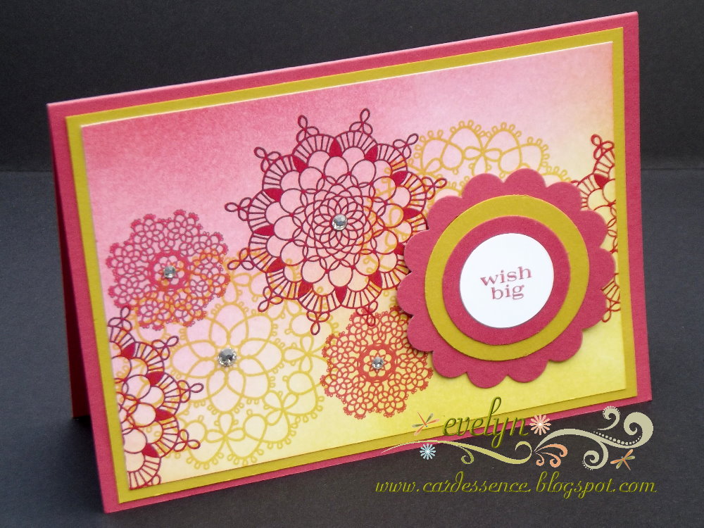
project recipe
stamps: Delicate Doilies  (W124960, C122592), Pennant Parade (W125012, C122742
ink: Classic Stampin' Pad - Primrose Petal (126858), Summer Starfruit (126991), Raspberry Ripple (126859)
card stock: Primrose Petals (127544), Summer Starfruit (127542), Whisper White (106549)
tools: Brayer (102395), 2-3/8" Scallop Circle Punch (118874), 1-3/4", 1-3/8" & 1" Circle Punches ( 119850, 119860, 119868) 
added pizzazz: Rhinestone Basic Jewels (119246), Stampin' Dimensionals (104430)


cardessence tips
  • roll only in one direction when you are loading ink onto your brayer as rolling it back and forth will leave "ink lines" on your roller which will transfer to your cardstock and thus will spoil the blend;
  • you can start with either Primrose Petal or Summer Starfruit in opposite corners but do not start brayering right onto the card stock ie. work from outside your card stock into the middle;
  • there are 2 ways you can work your brayer (assuming that you are right handed)
  1. Brayering with a cardboard underlay: With the brayer in your right hand, roll it back and forth from outside your card stock (right to left) into the middle - the colour lightens as you move into the middle. This method works best because the brayer being rolled back and forth and right to left will then not cause the cardboard to crinkle and scrunch up underneath your brayered card stock which will cause uneven ink distribution.
  2. Brayering with paper underlay: The above method will cause the paper to scrunch up underneath the card stock so the best way is to roll your brayer back and forth without moving from right to left. You will have to coordinate this with feeding your cardstock into the brayering ie. move your card stock from left to right. Heh, heh, heh, it's a bit like rubbing your tummy whilst patting your head and vice-versa.
  • I don't think that you can truly understand the difference and why it works without trying it out so, give the 2 different ways a go if you are new to brayering - hope it all makes sense.
Well, I hope that you enjoyed reading about my misadventure and had a good laugh about it. By the way, I have just received my very own SU brayer (a month after the catalogue party). Look for more of my brayered samples that I displayed at the catalogue party in my next posts.

TTFN

Saturday, August 25, 2012

Apothecary Pyramage

Months and months ago, I borrowed some card making magazines from our local library and one of them contained lots of cards which were made up in layers of the same image. I had never seen this technique before. They were made from down loadable images or purchased kits. I noted it down as one of my "to try out one day" list but it just seemed to be too difficult to incorporate it with stamped images and trimming/cutting layers of the same image to match. When Stampin' Up! debuted the Labels Collection Framelits and the coordinating Apothecary Art stamp set in the 2012 Autumn-Winter Mini Catalogue, I was immediately struck with how easily I could attempt this technique. However, the magazine failed to mention what this technique was called but my internet research was fruitful and I believe that it's called "pyramage".

So, here's my pyramage version - hand stamped, coloured and layered. I was very pleased with the results and hope that the photos do it justice. All items used in this card will return in the 2012 - 2013 Annual Catalogue (formerly called Idea Book & Catalogue or IB & C) but I am sad to say goodbye to my favourite background stamp set, Baroque Motifs which will be retiring at the end of this month.

project recipe
stamps: Apothecary Art (W127506, C125527), Teeny Tiny Sentiments (W119185, C120024), Baroque Motifs (W116340)
ink: Classic Stampin' Pad - Early Espresso (119670), Pretty in Pink (101301); Stampin' Write Markers - Pretty in Pink (100045), Regal Rose (105108), Lucky Limeade (123002); Jet Black StazOn (101406)
card stock: Early Espresso (121686), Lucky Limeade (124388), Whisper White (106549)
tools: Big Shot (113439), Labels Collection Framelits (125598), Square Lattice Embossing Folder (119976), Adorning Accents Embossing Folders (125601)
added pizzazz: Crystal Effects (101055), Pretty in Pink Stampin' Pastels (120962), Sponge Daubers (102892), Stampin' Dimensionals (104430)
 
cardessence tips
  • stamp your image 4 times with black StazOn and run it through the Big Shot with the Labels Collection Framelits in 4 different sizes;
  • colour the flowers, leaves and banner borders with your markers;
  • use the Pretty in Pink pastel for the main part of the banner;
  • apply Crystal Effects to the flowers and set aside to dry;
  • whilst matching the layers, adhere with Stampin' Dimensionals.


I love the Apothecary Art stamp set and Labels Collection Framelits. There are so many ways that you can use these two items either individually or together for gorgeous paper crafting creations, this easy pyramage technique is just the tip of the iceberg. I highly recommend them as additions to your card making and scrap booking repertoire.

happy stamping


Wednesday, May 16, 2012

First Communion Invitation Cards

I've been having all sorts of computer problems lately that I think it’s time for a new one. Hence, I've been unenthusiastic about blogging. However, I can't resist sharing with you the invitation cards I made for my eldest son's First Eucharist (Communion). I am so pleased with how it turned out but I must warn you that I used a retired Stampin' Up! set to achieve what I wanted. Everything else is new especially the gorgeous Designer Series Paper and Labels Framelits from the 2012 Autumn-Winter Mini Catalogue.

Don't they look fabulous? I used the Twitterpated DSP which is soft and feminine on one side and geometric and masculine on the other. I only used the Island Indigo and Basic Grey pieces for all the invitations.


As you can see, these gatefold invitation cards are interlaced and locked in place with a set of nesting Labels Framelits die cuts so there is no need for ribbons or belly bands to hold them together. I also embossed the top most Labels Framelits die cut with the oval Designer Frames embossing folder - totally love this textured effect. Then, I cut out the dove and popped it on top with dimensionals so that it sits over the larger white frame as a catch to prevent the card popping open too easily. This extra measure is optional because the interlacing Labels die cuts work well in holding the folds together anyway as shown in the inset photo.

Here's what the inside of the invitation looks like. Instead of just stamping the Cross onto the card, I stamped it separately, cut it out and adhered onto the card with dimensionals. The flower on the left was stamped straight onto the card, coloured in with a blender pen and Stampin' Write Markers with Dazzling Diamond centres.


I am so pleased with this design and if you love it too, do leave me your comments. Here's the project recipe.

project recipe
stamps: Special Blessing (retired), flower from
Thanks for Caring (retired)
ink: Classic Stampin' Pad - Island Indigo (122937), Basic Grey (109120); Stampin' Write Markers - Island Indigo (123002), Basic Grey (120966)
card stock: Whisper White (106549),Island Indigo (124390), Basic Grey (121689)
dsp: Twitterpated (125406)
tools: Big Shot (113439), Labels Collection Framelits Dies (125598), Designer Frames Textured Impressions Embossing Folders Set (123130), Word Window ( 119857)
the added pizzaz: Blender Pen (102845), Dazzling Diamonds (102023)

cardessence tips
  • each A4 card stock sheet should give you 2 cards - firstly trim it so that it measures 8" wide then using your Simply Scored Scoring Tool, score at 2" down the longest length, turn it 180 degrees and score again at 2";
  • cut the card stock in half at its longest length;
  • when you fold your card, ensure that the centre edges are aligned and meet neatly in the middle ie. fold one flap first and force the other to meet up - use your bone folder to press and burnish the folds for a crisp neat fold;
  • use your 3 smallest Labels Framelits by nesting them evenly on Whisper White card stock and run it through the Big Shot - this will give you the outer Label frame and the smallest Label piece (top most layer) in a single run through the Big Shot;
  • run the card stock piece through the Big Shot with the 2nd smallest die followed by embossing with the oval Designer Frames folder;
  • adhere both Label pieces together with dimensionals;
  • adhere the frame (Whisper White) piece on the left first, and whilst keeping it in a folded position, adhere the Label piece by sitting it inside the frame piece - this will ensure that both sides are completely aligned;
  • lastly, adhere the dove.
happy stamping